Iteration as brand strategy
It started with a dating app. Six years later, I’m still working with Shekhar Yadav and the StudioBox team, turning new product ideas into brands with stories of their own. Quite a few stories, actually.

Love’s in the air.
Shekhar Yadav first came to StudioBox with Parooz, his take
on a dating app. Together with Renzo Bianchi and Gerardo Picón,
we worked across concept, strategy, UX, UI, branding, production, looking at the same product from different angles.
My role in the team got defined clearly really fast:
what it needed to say, and how to say it.
That meant getting properly familiar with the dating market.
We tried competing apps, studied their patterns, and looked
at how each one introduced itself. For me, that research helped
me to connect the product experience with the promise we were making through the identity. (Also to learn about how dating
apps actually work, Jesus...)
Parooz launched, but it also started something bigger.
Shekhar kept coming back with new ideas, and our work
grew into an active partnership with 23ventures.
We’d found a way of working together.
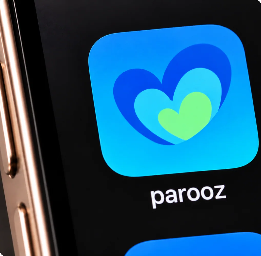
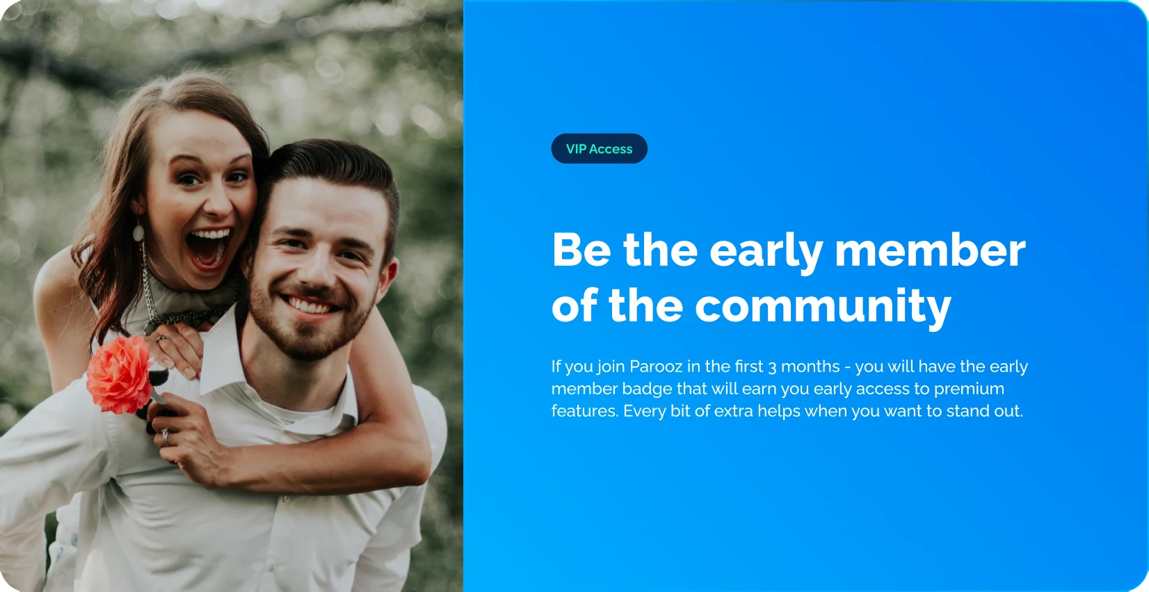
Every project had its own conceptual narrative, one we discovered while building. Brand and product took shape together,
as part of the same process.
 Legacy inherited versionRedesign version
Telling stories, making
products with them.
Working with 23ventures started to feel like a product lab.
Shekhar, the founder, would bring an idea, we’d sketch it, prototype it, and see what it could become. Friday afternoons were for showing him what we’d been trying (plus chatting a lot about politics and sports).
There was room to follow a hunch and see where it went.
At StudioBox, Renzo and Gerardo own UI and design engineering,
and I own brand strategy and visual language. But there’s always
a point where we have to work across both at once. That overlap
is what gave me a real understanding of how products get designed.
Those Fridays let me explore a different narrative each round.
As the product became clearer, so did the message, and the identity had to keep up. Six years in, that back-and-forth is still part
of how we work.
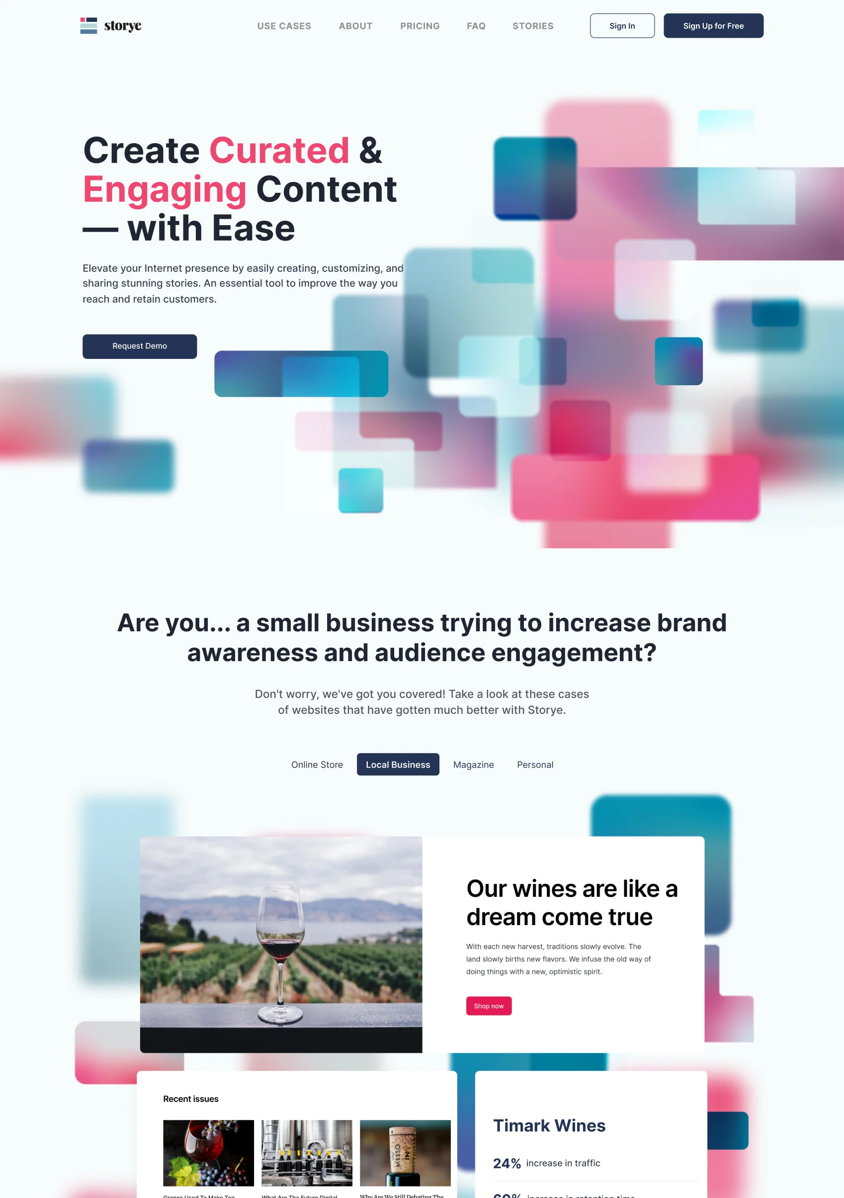
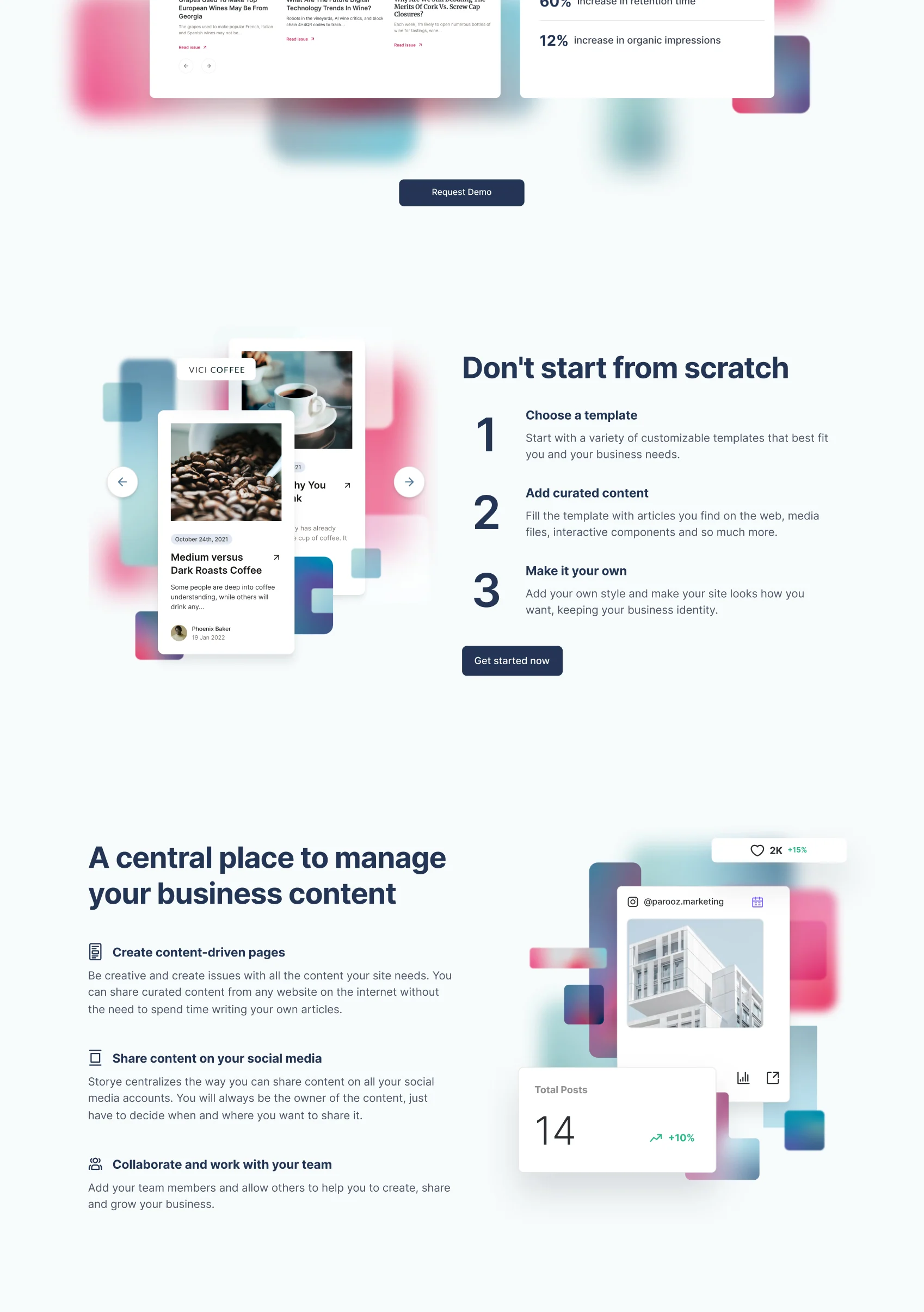
Before the AI boom, Storye was already exploring how to automate the work around online content. It brought newsletters, web publishing, and content management into one platform, with templates and tools to help people put their ideas in order.
There was a lot going on under the hood, and my job was to find
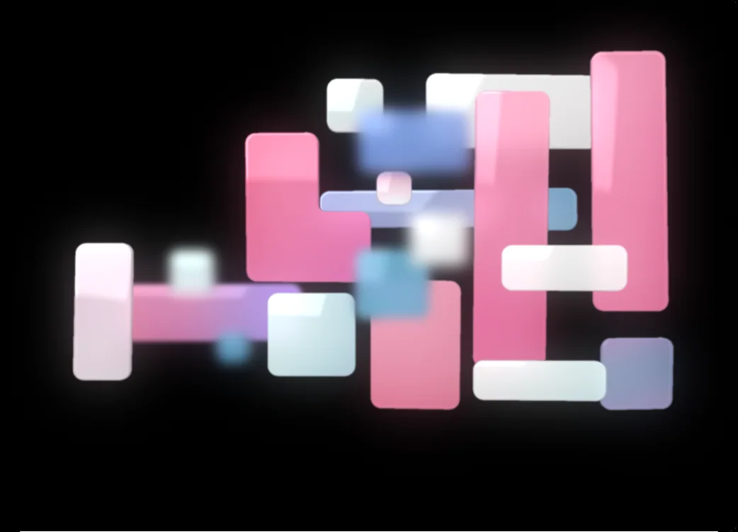
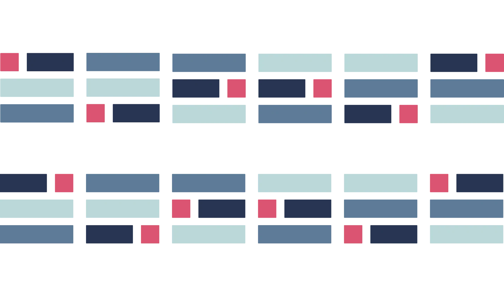
a visual idea that could hold it together. I built the identity around small, moving blocks: pieces of content arranging themselves into
a story, much like the content people would use Storye to create.
That gave us a way to talk about the product while we were still figuring it out.
Years later, we went back to Storye and several other projects
with AI. Not to update them, but to see how we’d solve the same problems today, and how much more efficiently we could get there.
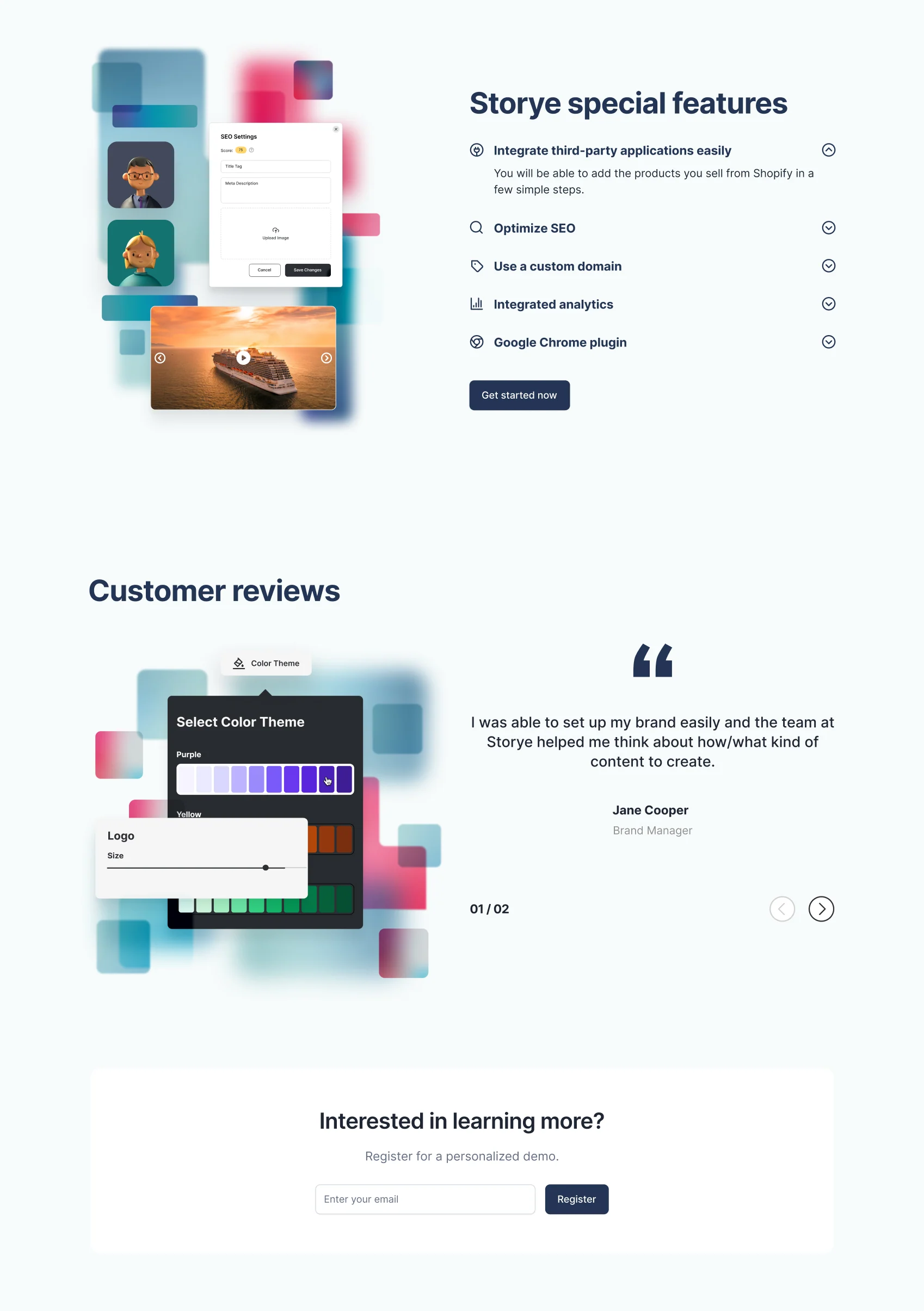
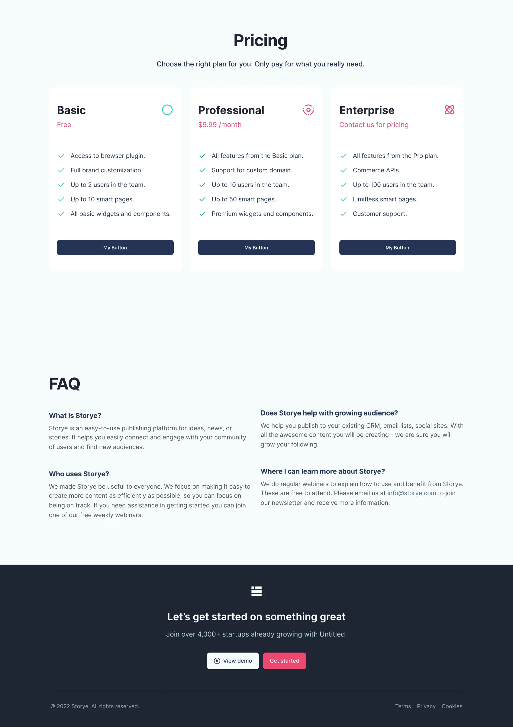
Storye Glass Gallery
PLAY WITH ITA little window into AI.
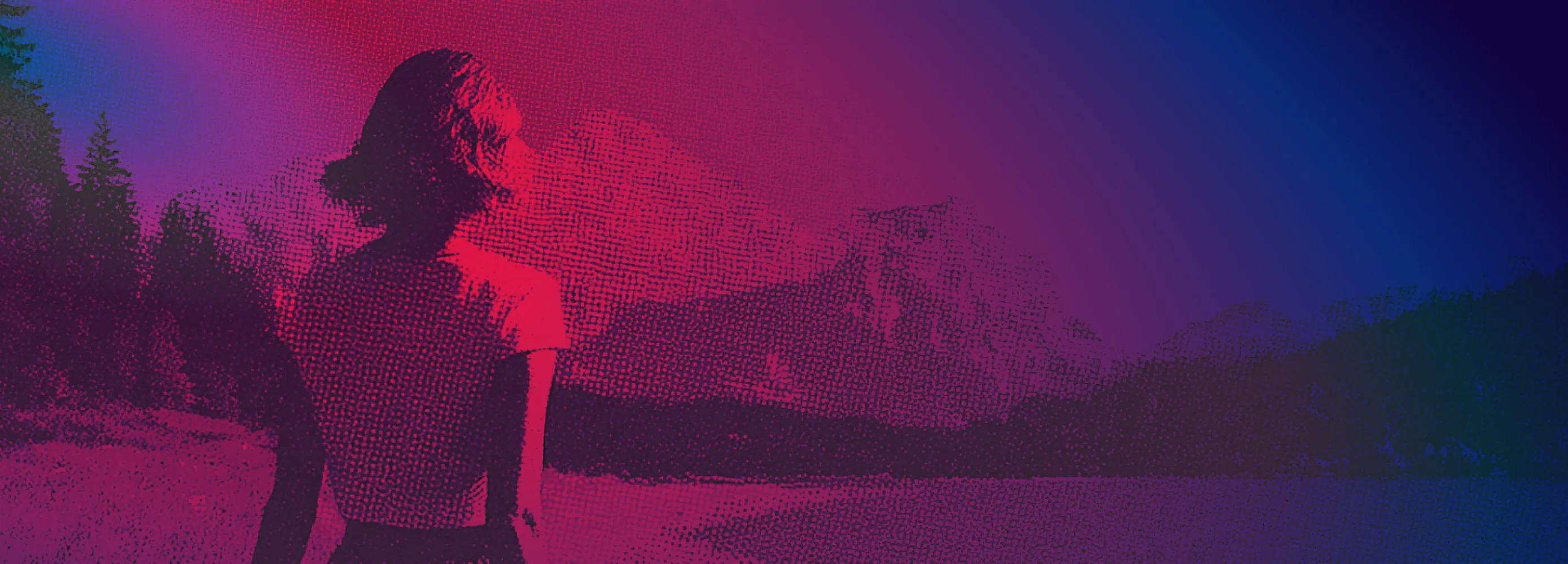
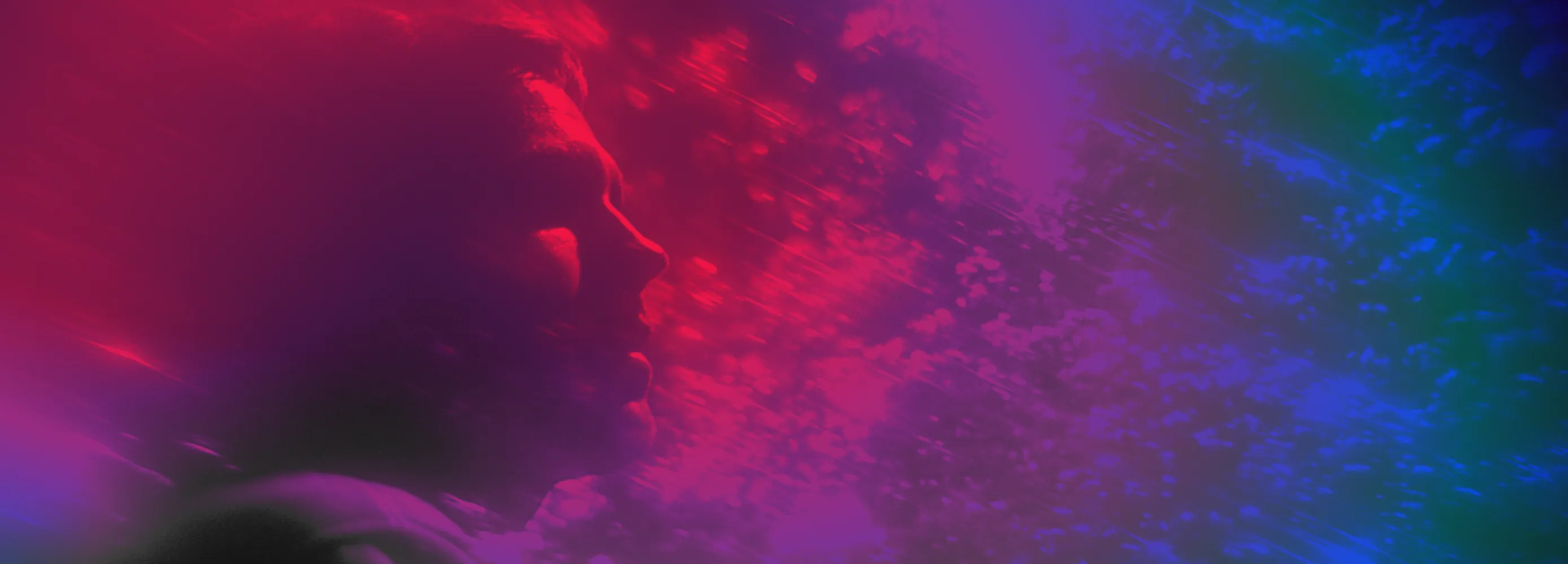
Axyen brings different AI tools into one dashboard for developers and everyday automation. I approached its identity through language:
how could I make something so abstract feel within reach?

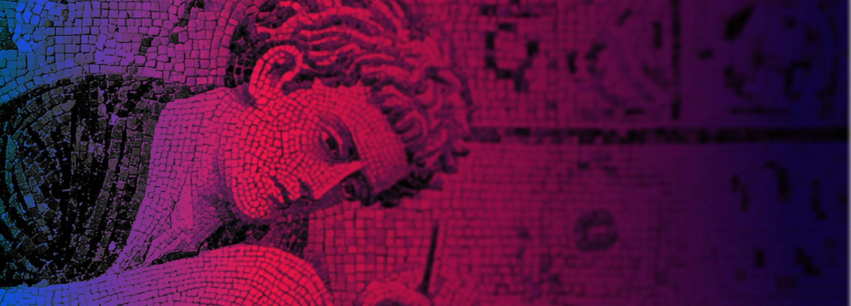

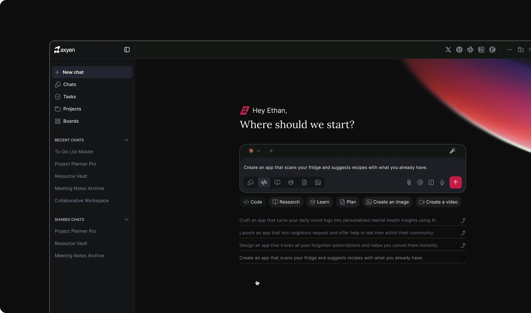
Bigger products, same process.
Over time, we refined the process to take on more complex work. Products like Axyen weren’t simple apps anymore, but multi-part systems that had to work across devices.
That meant design systems built from scratch, animation, asset production, and eventually development too. Everything went through rounds of testing with Shekhar, looking for what else we could try, cut, or rethink.
At the same time, we coordinated the build, working hands-on with his development team as they brought our designs to life in parallel.
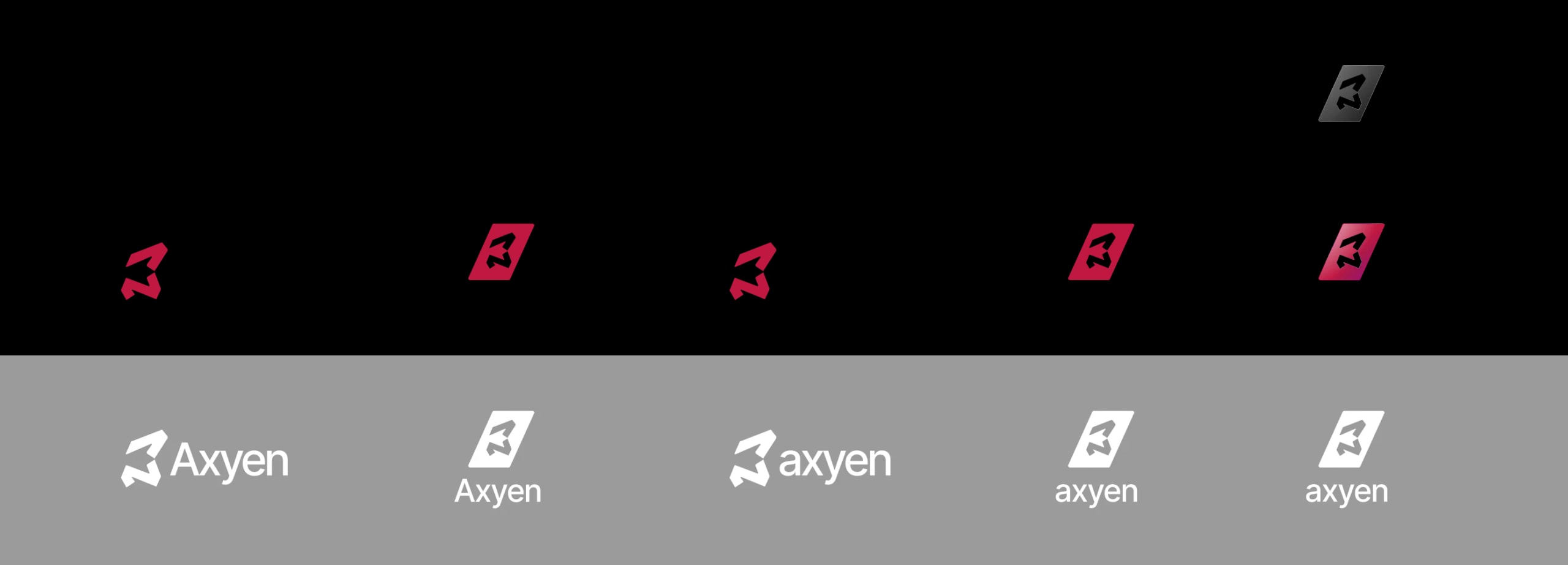
Axyen’s system of abstract symbols became
a playful fiction for the brand: a glimpse into the world on the other side of an LLM.
It is all about language.
Axyen Mascot lab
PLAY WITH ITIf there was a new product,
there was a new conversation.
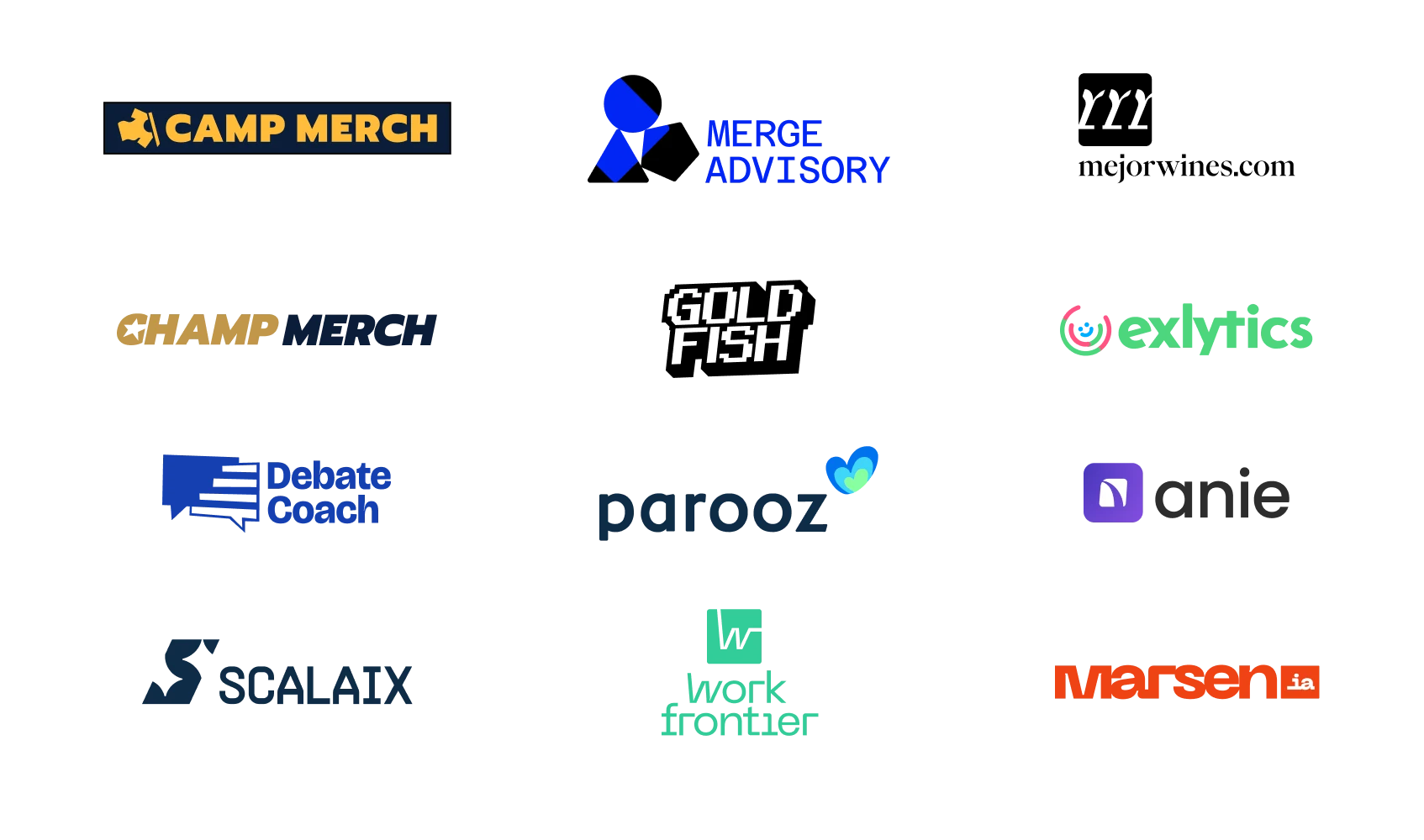
Games, finance, developer tools, marketing, even wine. Each idea came with a different audience and a new story to figure out.
I got to think about the strategy to tell it every time.
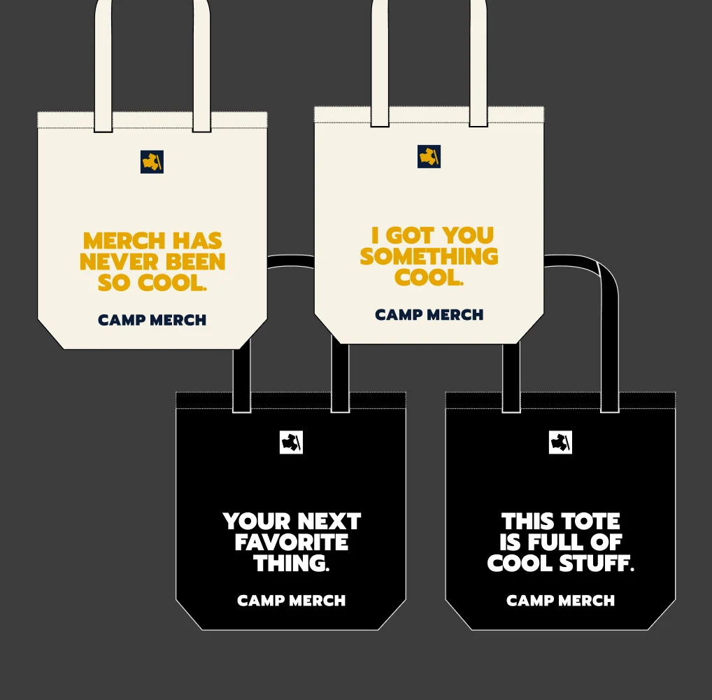
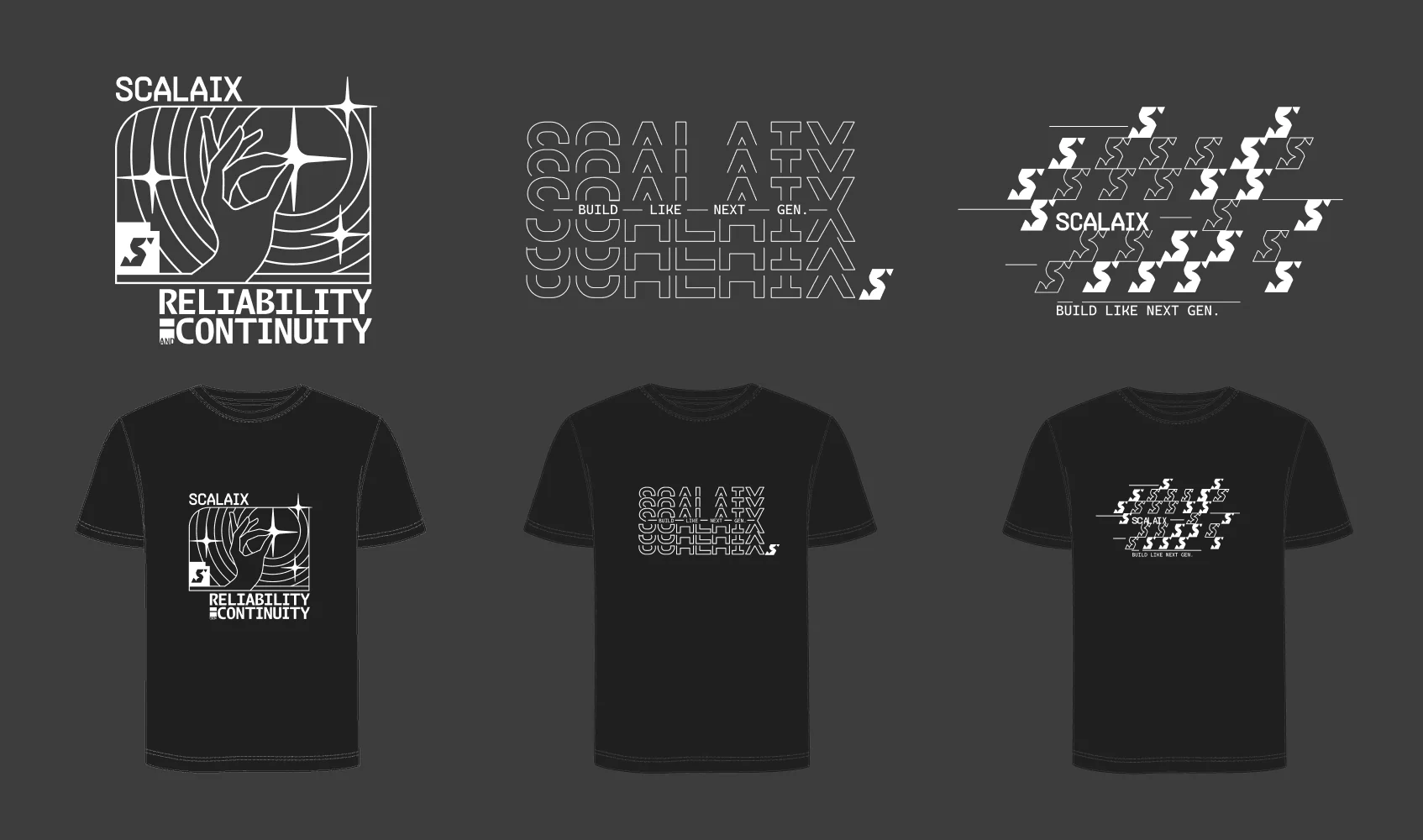
Eventually, some of that work made its way off the screen: illustrations, T-shirts, pins, and tote bags, alongside social content and pitch decks. Each format asked something different of the brand, and gave me another way to explore what it could say.
For StudioBox, this relationship meant growing across a wide range of products and changing the way we work. For me, it was a long practice in adapting: getting to know a new product, finding the message, and making the visual decisions that made sense for it.
That’s what kept it interesting: moving between strategy, identity,
and execution, project after project.
Six years, more than 20 brands, over 15 product design projects, and at least
10 apps on the App Store.
Plenty of ways to tell a story, but the question behind the work stayed pretty much the same.
What are we saying?