Identity, Security and Possums.
I came in for two months of illustration work. Almost three and a half years later, I’d helped shape Smallstep’s brand across screens, systems, and actual, physical spaces. Quite a brief.


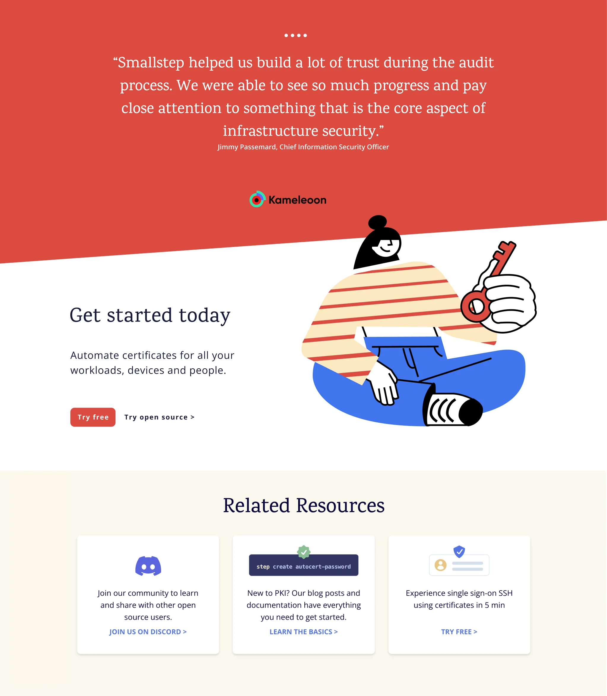
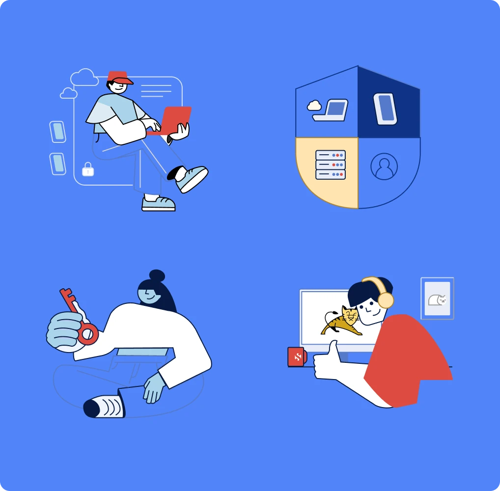
First, I had to understand what we were actually talking about.
I joined through StudioBox to illustrate Smallstep’s new website, under the direction of Thomas Richardson and Becky Buck.
Smallstep works in device identity, making sure the devices accessing a company’s resources can be trusted. I knew very
little about that world, so understanding what I was drawing
became a big part of the job.
We started with the human side: characters, familiar situations
and visual metaphors to make a complex subject feel approachable.
We eventually moved away from those first illustrations, but they helped us find our bearings: how far we could simplify, where a metaphor stopped helping, and what the brand needed to
say more clearly.
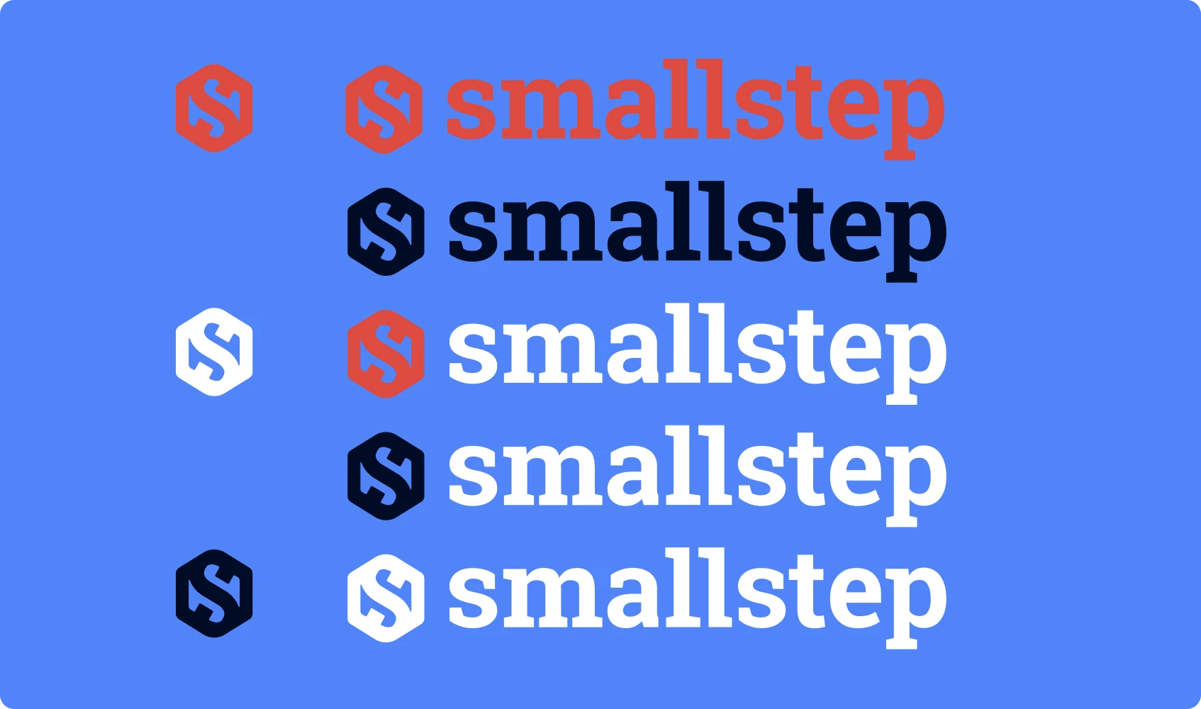
 Legacy inherited versionRedesign version
Once the illustrations sat alongside everything else, we started
to see how other visual structures needed attention. The logo
was one of them. Smallstep had to stay recognizable, so I refined
the lettering and redrew the mark to work across the applications
we had in mind.
At StudioBox, I worked alongside design engineers Renzo Bianchi
and Gerardo Picón. The brand strategy was a natural consequence of their process studying the UX UI structure of one of the main Smallstep products. The setting of these brand strategy decisions into the component system: type hierarchies in Karma and Open Sans, color roles, and gradients gave us a lot and new room to play.
The illustration brief had become a brand design role, with
Becky helping me keep track of how everything connected.
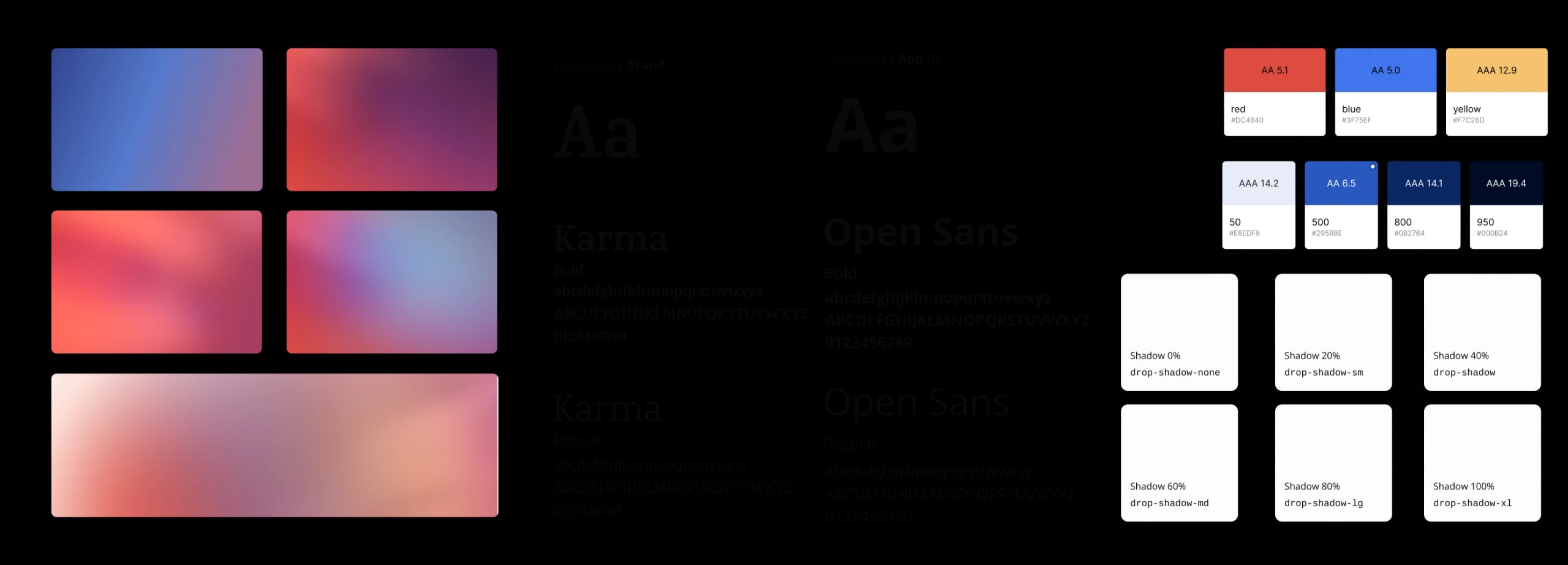
This is where all those little decisions started adding up. The website gave us a place to bring the system together and see it working.


































Some of those decisions
were moving, too.
Working together on these cards, we brought illustration into the interaction, with animation responding to the way people used them.
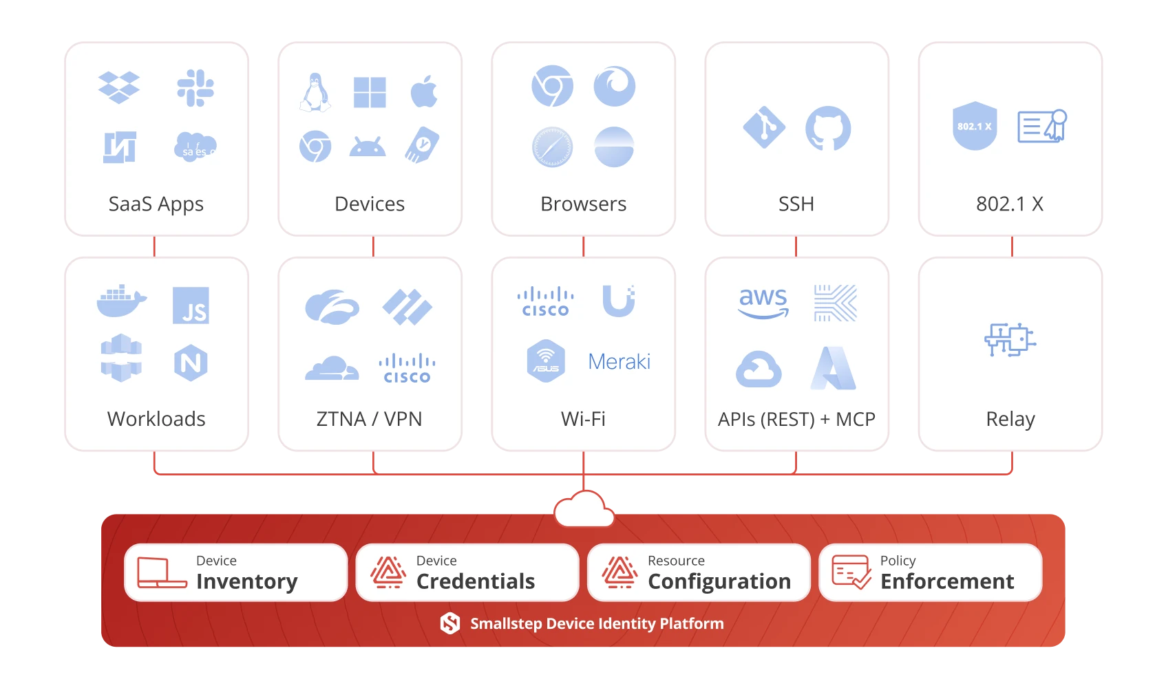
Smallstep had a lot
to tell and explain.
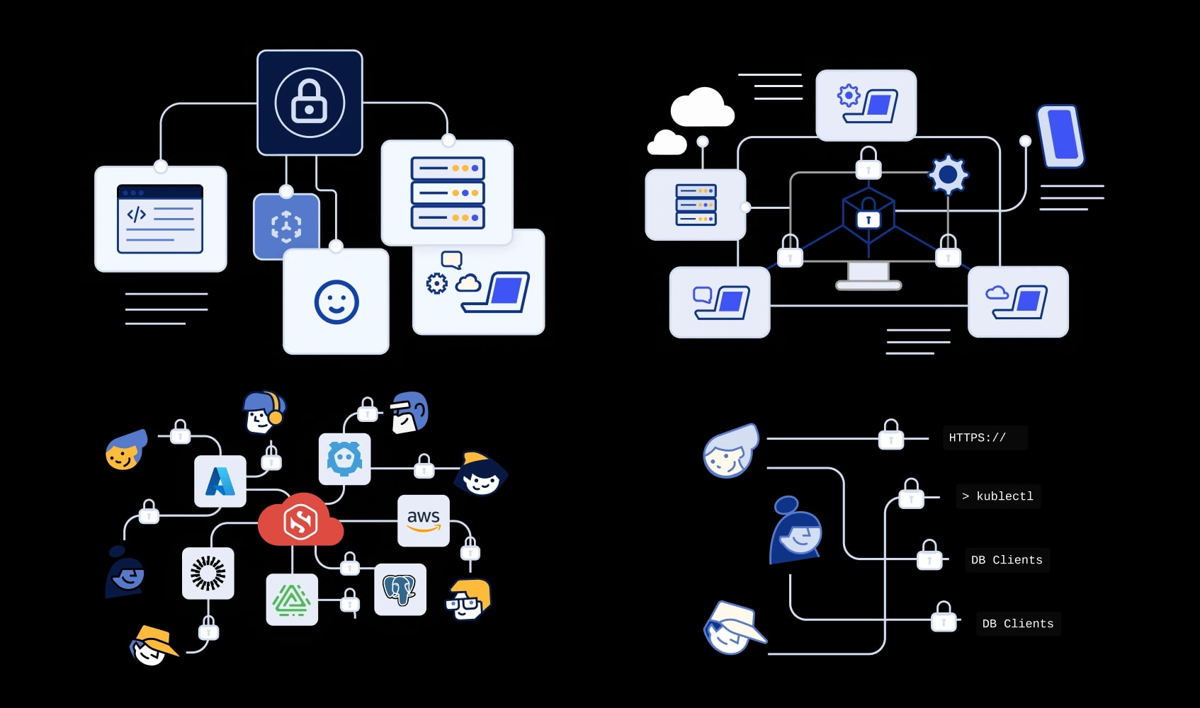
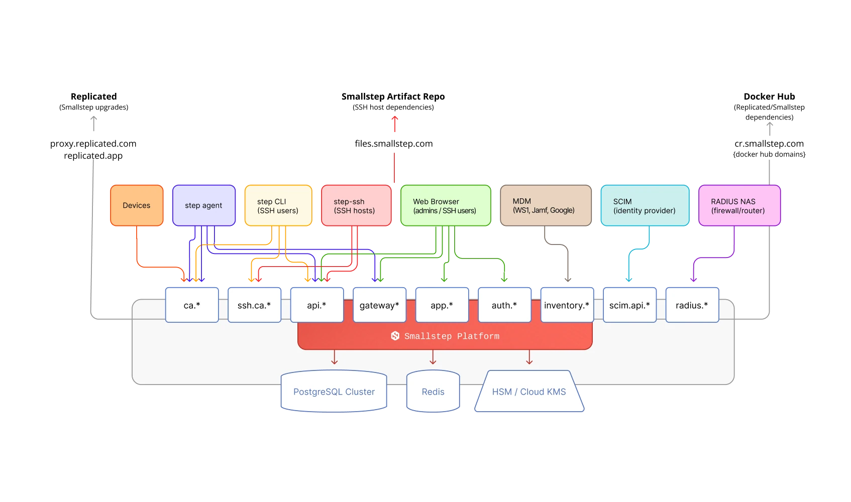
The team would often send me sketches drawn with pen and paper. There was plenty of knowledge in those boxes and arrows. Getting my head around it was part of the work.
I had to understand what connected to what, which details mattered, and how to give someone a clear path through the information. This is where my usual “what are we saying?”
question became very practical.
The people reading these diagrams often knew the technical side far better than I did. My job was to help them find their way through it, keeping the important details intact and making the whole thing easier to read.
Of course, some explanations needed a lot more of iterated detail.
As the diagrams grew, we had to make sure the visual language
could keep up with them. Every new layout was a chance to see where the system helped and where it needed adjusting.
Smallstep also wanted to build a library of this information,
so it mattered that the pieces could work together and be used again. I worked on ways to carry the same logic across different diagrams while leaving room for what made each one specific.
This part of the project kept me learning. To organize the information properly, I had to keep getting familiar with the things the team
was building.
By this point, the style code we set for the brand was already at work everywhere the brand needed to show up, offline included.


We also produced the assets for Smallstep’s marketing campaigns, which ran mostly on LinkedIn. Social is hard to call in advance and what performs rarely matches the hunch, so we tested as much as we could: variants in layout, copy, imagery, format and color, each measured against the others. A single campaign could easily end up with 12 to 70 pieces to publish.
That’s why every campaign was built as a system inside shared design libraries, set up so teams outside design could produce pieces on their own without stepping outside the brand. That made the brand faster at meeting its content needs, and each campaign easy to adapt for the next one.
Below, a single campaign from July 2025.
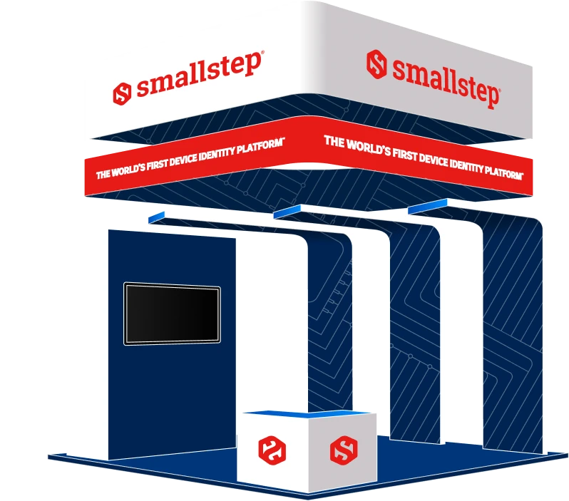
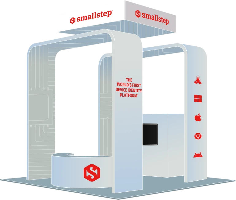
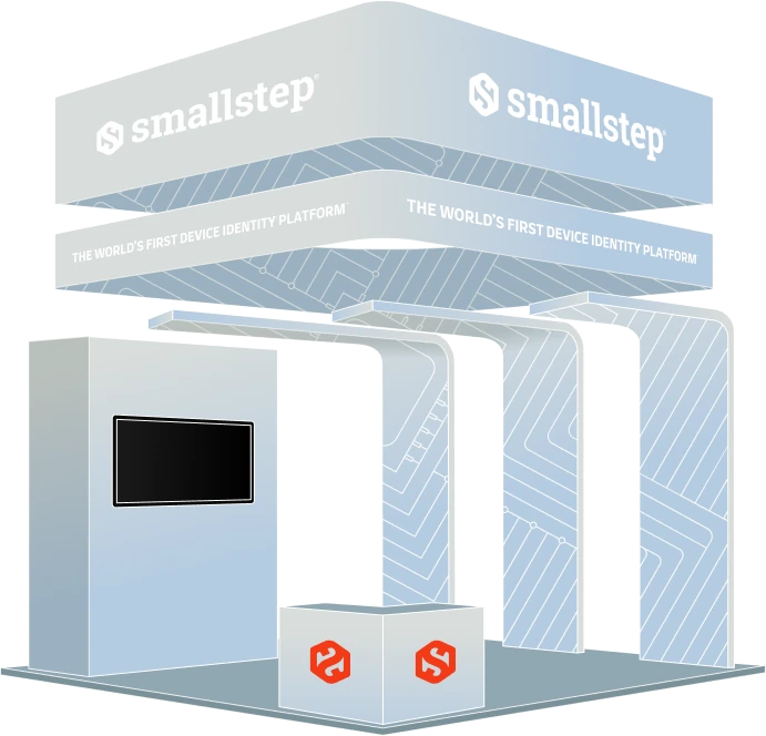
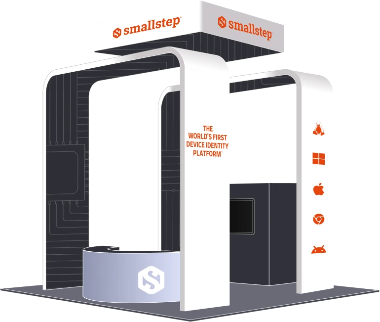
At some point, I was choosing materials for an exhibitor stand.
That was quite a way from the original website illustrations.
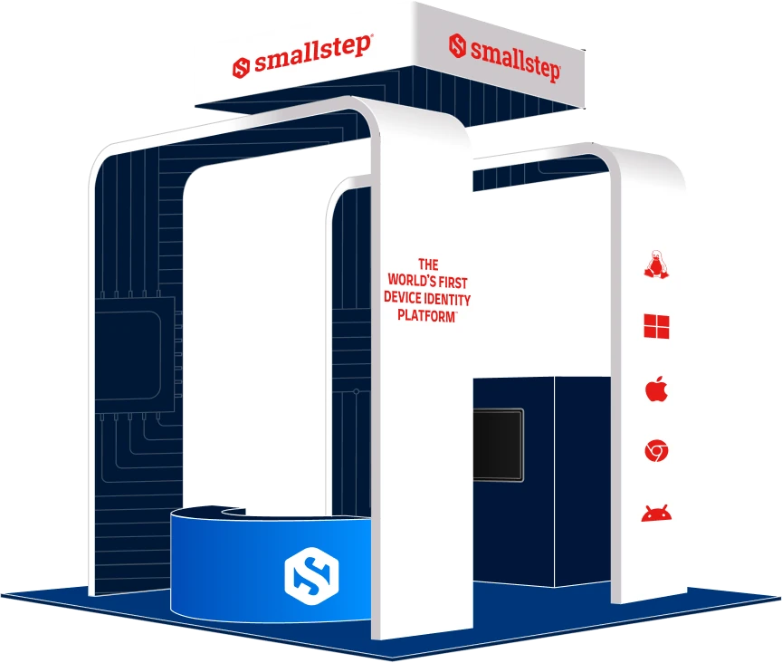
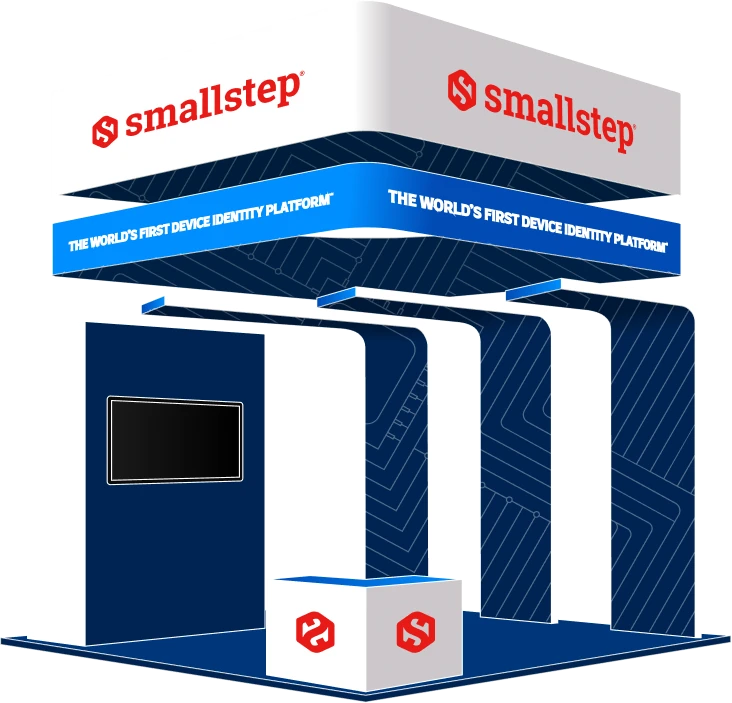
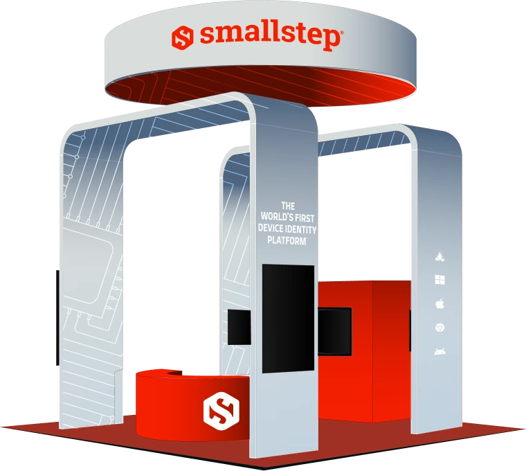
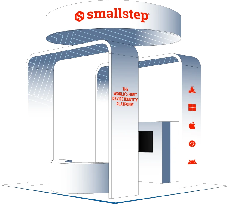
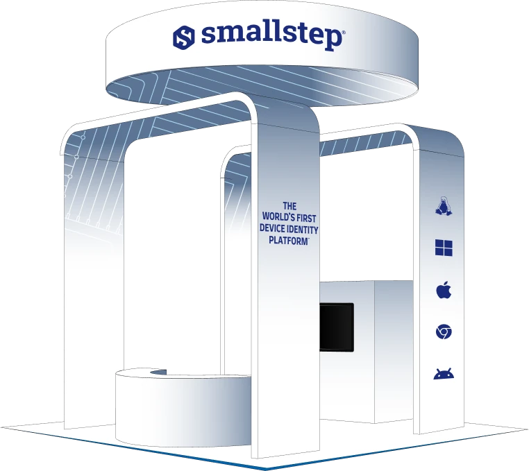
As Smallstep needed to mark their presence in big tech events, we were in parallel working out how the identity could work in these physical spaces, with a whole new set of things to consider.
I designed stands in 3D, re mapped mockups, explored materials, and created multiple graphic systems to help the team to personalize the stands based on their requests. The system now had to make sense at the scale of a booth, with real surfaces, production constraints, and people moving around it.
The two-month contract ended up lasting almost three and a half years. Looking back, this part makes that change in scope especially visible: I’d come in to draw a few assets and gradually become involved in how the brand showed up.

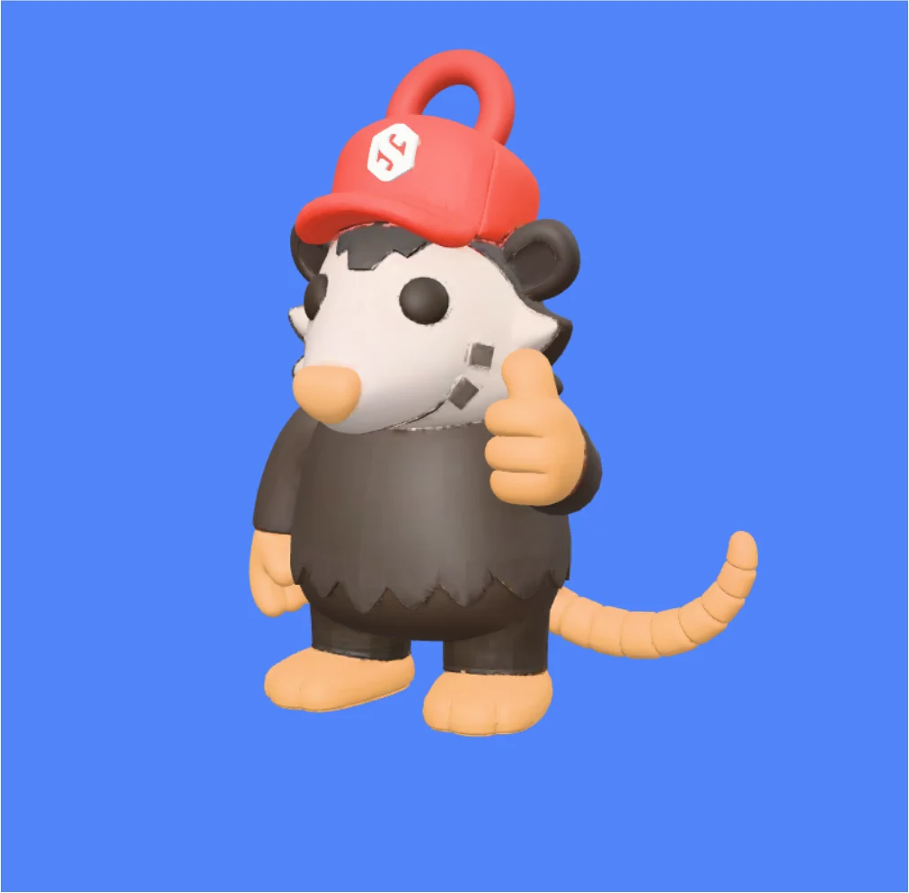
And yes, there were Possums. The event stickers gave us room to have a little fun and keep that friendly side of the brand around.
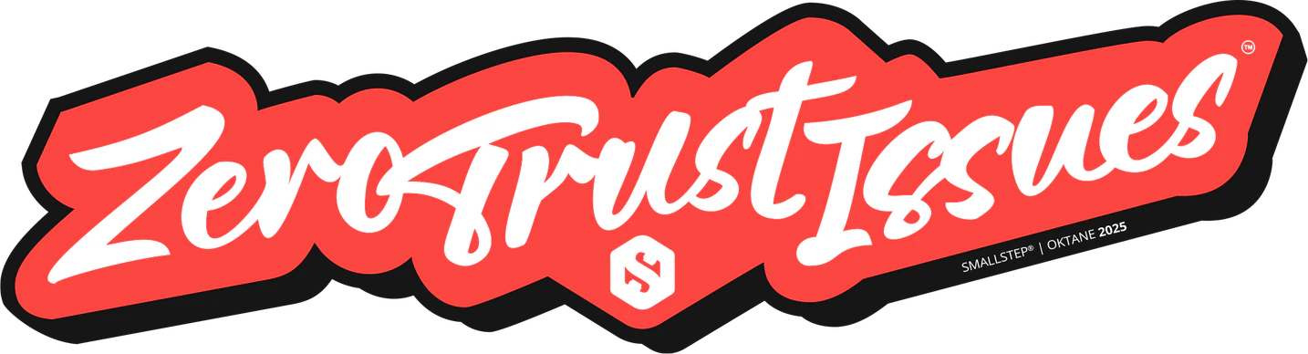
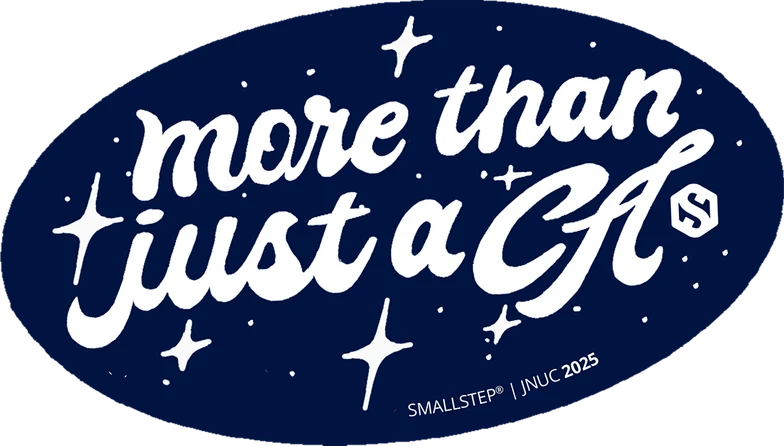
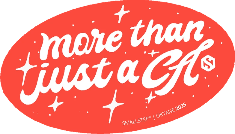
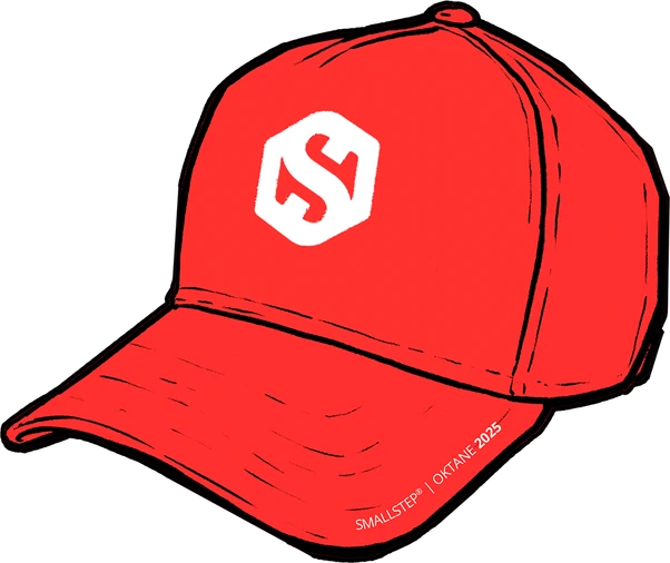
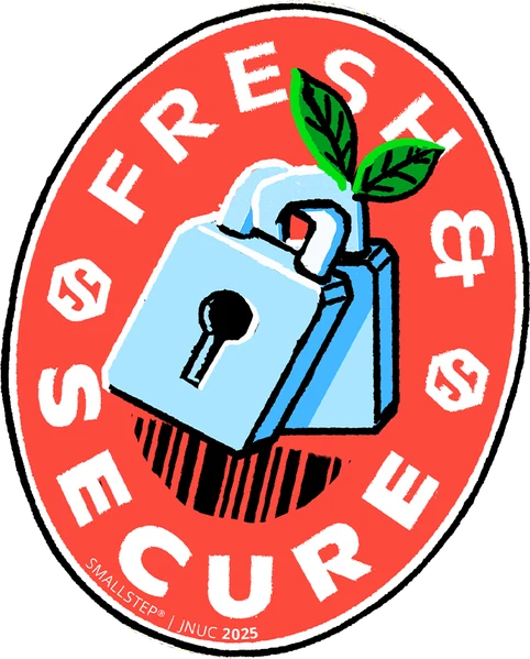
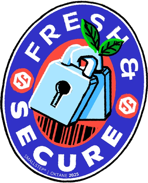
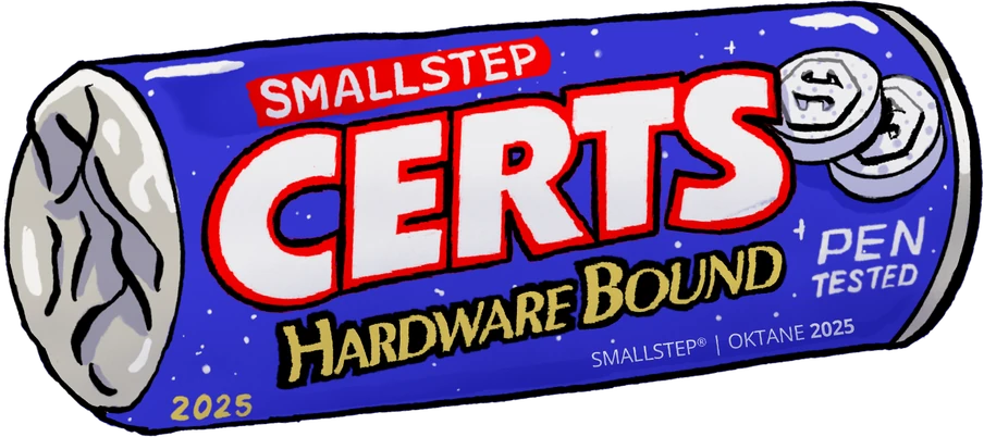
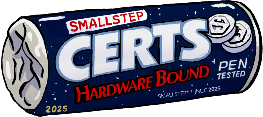
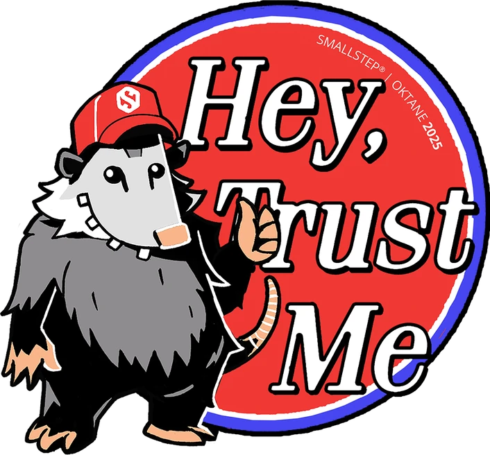
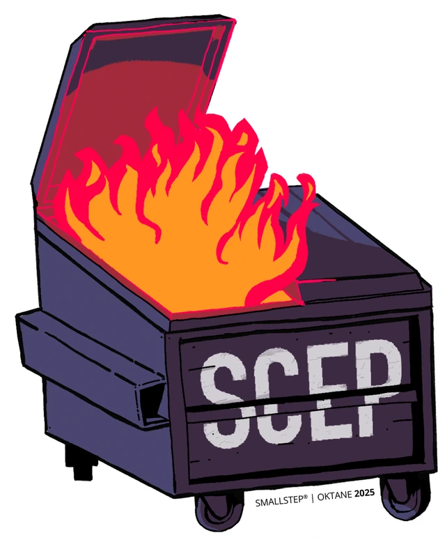
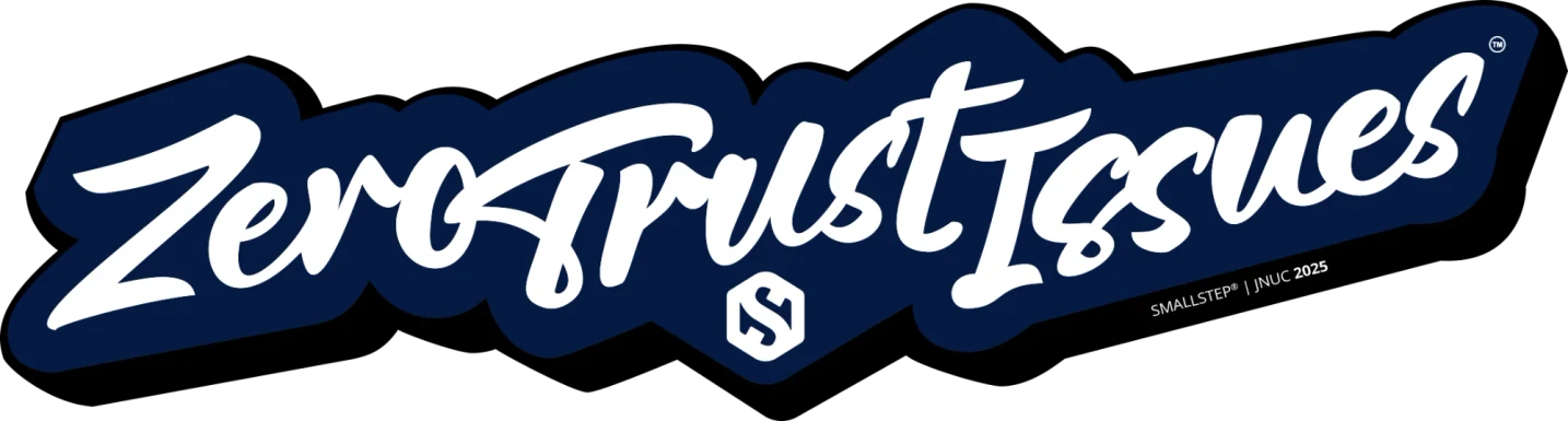
The stickers and the icon system asked for different things from me. One gave us room for jokes; the other needed a consistent way to communicate specific information. I enjoyed moving between those needs and figuring out what each piece had to do.
Over the project, I worked as an illustrator, brand designer, systems designer, strategist, and sometimes even a product manager, always alongside people with different expertise. That’s what stayed with me most. A brief can get you started, but understanding what a brand needs takes time.
You have to be willing to revisit your own ideas, including the ones you like, and let what you learn shape the next decision.

The big part of the job was staying curious, being useful, and giving the work room to become what it needs to be.
I’d happily do that again.